Whoa. What Happened? Like many, I was shocked last week when I logged into Google+ and found that the search giant had quietly rolled out a massive revision to their social platform — both in terms of appearance and features. This marks the most substantial face-lift to Google+ since it’s release last summer.
So, what’s new and, most importantly, what does it mean for your brand’s presence on Google+? And how does it impact Google’s brand overall? Let’s take a look at each of these issues.
What’s New: The Good, the Bad, & the Ugly
Enough fluff. What’s new in this version of Google+? For each new feature, I’ll note if it’s good, bad, or just ugly.
THE FRONT DOOR
New users will now be greeted by a completely revamped login/homepage. Previously users saw Google’s standard but stark welcome with emphasis on the right-hand side login. The new front door offers more of a marketing homepage designed to transition the network from early adopters to early majority with rich graphics and videos explaining signature features. The multi-colored hand-drawn arrows and circles from V1 have been traded for a cleaner overall UI.
Good/Bad/Ugly? Good. This is a grown up thing to do as the network matures and needs a better explanation for folks that don’t read Mashable every day.
A COMPLETELY OVERHAULED INTERFACE
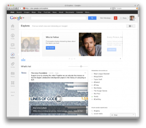 Brace yourself. What you see after login is dramatically different than how Google+ looked before. This is a big deal because much of the early praise around the network focused on how clean the UI was compared to the cluttered look of Facebook. It seems that Google has learned what Facebook did before it. To do more, you have to add a bit more clutter. The pages are framed with light gray that also houses most of your primary network navigation on the left-hand side with a “dynamic ribbon,” as Google calls it. As Hangouts have emerged as a stand-out feature, the entire right column has been devoted to Hangout management. The quick links for circle selections at the top is nice. While many have quipped about the increase in whitespace, this is in the eye or the browser of the beholder as Google also migrated to a responsive web design with this iteration as well.
Good/Bad/Ugly? As a few of the supporting features below reveal, I think there’s progress in this update but it could be called a bit on the Ugly side of things.
EXPLORE
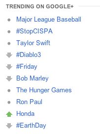 A signature feature of the new Google+ is the addition of Explore, which they preset near the top of your navigation ribbon. This tab provides you with popular posts from inside and outside of your network, which encourages you to explore new users to follow (Google even recommends some in the header). And, because Google couldn’t let Twitter have all of the fun, this new tab also provides insight into what’s trending on the network.
Good/Bad/Ugly? While heavily influenced by Twitter’s role in leading and monitoring trends, this is a vast improvement on the network’s first version of this feature, Sparks. It also offers a nice way to encourage users to find interesting people and brands to follow. All of this makes Explore a Good update as well.
DRAG & DROP TOOLBAR
The main navigation toolbar on the left-hand side allows you to drag and drop the icons to customize your interface. If you love Google’s large photos, you can bump this tab up a bit. If you conduct weekly team meetings with Hangouts (like our team does) then you can slide that icon up as well.
Good/Bad/Ugly? More dragging and dropping is always an easy win — Good!
BIGGER PHOTOS & VIDEOS
In a recent piece I wrote for MarketingProfs I talked about the increasingly visual nature of our brands on social media through platforms like Pinterest and Instagram. Google+ came out of the gate with larger images for shared posts, photos, and videos but this new release makes them even larger. While bigger isn’t always better, it does track with the trend toward more visual storytelling in social media. It also has an impact on your brand as you’ll see below.
Good/Bad/Ugly? A picture is worth a thousand words — Good!
 PROFILES & BRAND PAGES GET COVER PHOTOS
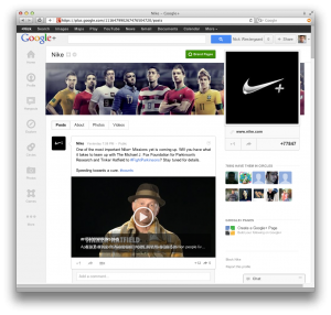
As if Google+ wanted to bite back for all of the “Is Google+ a Facebook killer or a Twitter killer?” talk, they decided to take a key feature from each with this update. While Explore works to supplant trending topics on Twitter, the profile pages just took a swipe at Facebook by adding a landscape ‘cover’ photo to the top of pages. While I like cover photos in general as they allow you to be more impactful, I’m not sure it was the right choice here as it dilutes their brand comparatively. They could’ve let Facebook and Path own covers and kept their unique tiling of smaller photos. However, when editing your cover photo you still have the option to chose if you want a cover or the five images tiled at the top.
Good/Bad/Ugly? Bad. More than improving something that’s broken this seems more like parroting. Your main avatar is also now left aligned which, while certainly different than Facebook, is a little odd earning it an honorary Ugly.
PRIVACY CONTROL GETS EVEN BETTTER
It’s now even easier via dropdown menus to decide which circles see which part of your personal info. A nice ‘View as’ tab at the top allows you to preview your profile from a certain circle’s vantage point.
Good/Bad/Ugly? Good! Privacy control is an important part of the Google+ brand DNA.
OMNISCIENT SHARING
A subtle feature in the redesign is an omnipresent ‘Share’ button in the upper right corner next to your avatar. This allows you to easily and consistently offer a thought or share valuable content on the fly.
Good/Bad/Ugly? It’s not the sexiest new feature but a more consistent sharing placement should trigger more consistent sharing — Good.
What Does All of This Mean for Your Google+ Brand Page
Unlike Facebook, which staggered the Timeline roll out of standard user profiles and brand pages, Google+ migrated everything in one fell swoop. And honestly, there aren’t a ton of crazy ways the features above impact your brand. It’s pretty straightforward:
- Cover Photo — Like Facebook, this is an opportunity to make a large visual statement — so do it. While you can size it once uploaded, the exact dimensions of the cover are 940 pixels x 180 pixels. As noted above, tiling five photos is so unique it’s interesting to see that several brands have kept their images in place rather than switching to cover photos right away.
- Visual Storytelling Is a Must — Like Paul Revere sounding the warning, it’s absolutely paramount that brands get proficient at visual storytelling. Between Facebook, Pinterest, Instagram, and Google+ there is a real visual revolution going on in social media today.
- Customization Has Its Perks — Organize your Google+ experience and what you share with whom with the new drag-and-drop features and privacy tools.
- Watch Trends/Lead Trends — Utilize Explore to monitor trending conversations for areas your brand can join in. By listening you can also learn more about how to make your message more trend-worthy as well.
- Toggle In/Out of Your Brand Page — The avatar in the upper right corner also makes it easier for you to toggle in and out of using Google+ as you and your page. You can also toggle in and out under the ‘Pages’ heading in your dynamic ribbon on the left-hand side.
The Impact on Google’s Brand
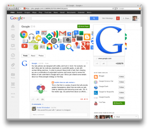 Since my first post about Google+ last summer, I can’t help but focus on the impact on Google’s brand as it carefully embeds this social layer to its formidable web footprint. With a reported 170 million users, a wave of revisions is probably intended to ease the transition from innovators and early adopters to early majority. In so doing, the challenge will be to preserve those core components of brand DNA that has helped Google+ stand out to date — clean interface (mostly intact), intuitive privacy and relationship organization (still there), and hangouts (hard to mess up).
Penny for Your Thoughts
That’s my two cents. What do you think of the newly redesigned Google+? Creative or cluttered? Are the new features promising for your brand or just more of the same? I’d love your take in the comments below.
Some Extra Goodies …
- Here’s Google’s official statement on the redesign from Vic Gundotra.
- Here’s a link to my review of Chris Brogan’s book, Google+ for Business.
- If you are new to the platform, here’s a link to my 100% free eBook, Google+ 101.
- Finally, here’s Google’s overview video on the update. Notice how they don’t say that anything’s new? It plays more like a new commercial for the platform.
