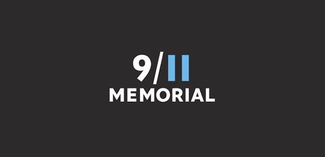
Less can be more. But sometimes it can be so much more. A timely example of this is the 9/11 Memorial logo above. I missed this when it was first introduced last year, replacing a more complicated and less memorable mark. As we near the 10th anniversary of that tragic and world-changing day, I discovered this logo on my Facebook wall and sat in silence staring. And remembering.
When you subtract elements out and strip the visuals down you leave room for the beholder to find personal meaning and emotional connection. That’s what happened to me when I saw those blue Twin Tower numerals set off from the rest of the logo.
Less can be so much more.
I won’t dissect the logo because no one does that better than the folks at Brand New. To learn more about what you can do to help honor the victims and heroes of that day, please visit 9/11Memorial.org.